
UX Workshops • Design Direction • UI Design • Accessibility • Design Systems
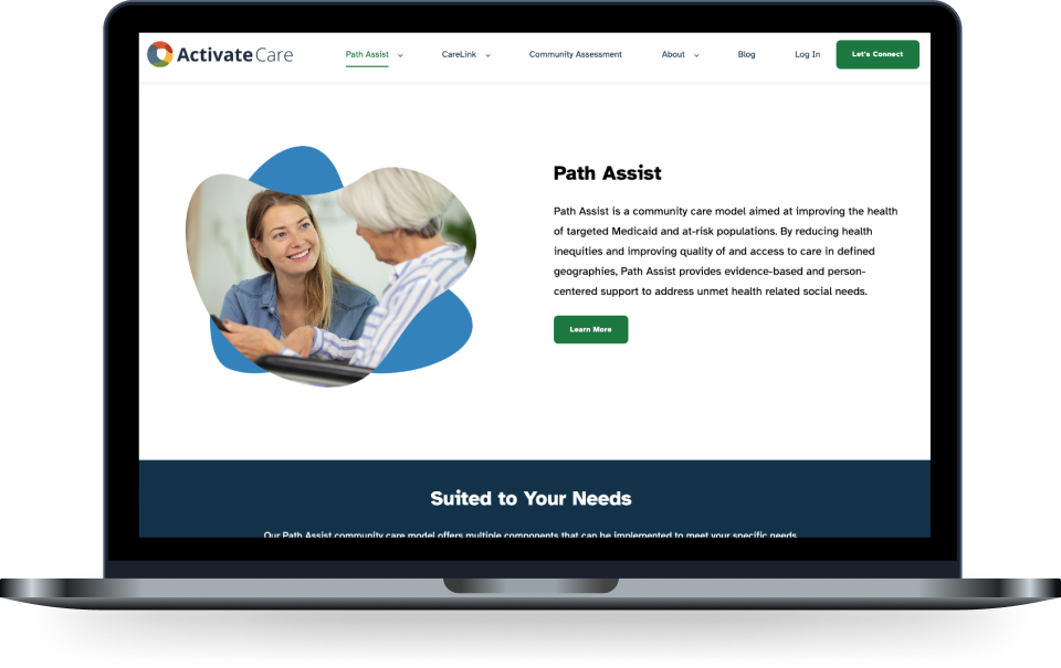
In collaboration with cross-functional teams, I spearheaded a digital design refresh focused on enhancing accessibility for patient applications. Our objective was to identify and address critical accessibility gaps to effectively support populations that faced significant accessibility challenges. To learn more about this initiative, check out the blog post I co-authored with our Lead UX Researcher.
Activate Care now has the foundation of an accessible and inclusive design strategy, which positions them to significantly reduce potential legal risks related to compliance issues. Additionally, this approach enhances their capacity to scale offerings to larger healthcare organizations, fostering long-term growth and competitive advantage in the industry.
Proto Persona Workshop
I facilitated a remote proto persona workshop with
Subject Matter Experts (SMEs) within the company to get the organization aligned on our users of these new applications.
Educational Presentations
I conducted desk research on populations with accessibility challenges and presented my findings to stakeholders. Additionally, I shared WCAG guidelines for design and development, ensuring that our approach aligns with industry standards for accessibility.
Audit of current offerings for accessibility
I conducted an audit of our current offerings for Path Assist and presented my findings to stakeholders for their review and consideration.
Accessable Components and beginnings of a Design System
I collaborated closely with the Engineering department to research and select a UI pattern library with built-in accessibility features. This initiative marked the foundation of our first patient-facing design system.
Through collaborative workshops with Subject Matter Experts (SMEs) in social and healthcare, and guidance from our Lead UX Researcher, we identified the need to design for accessibility from the ground up, ensuring that our products served both clinicians and patients inclusively. I facilitated a Proto Persona Workshop, developing personas focused on underserved populations, which shaped our design strategies.
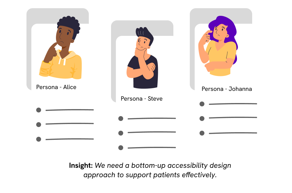
I collaborated with subject matter experts in a Proto-Persona workshop to establish a clear alignment on our target user profiles.
I conducted a comprehensive audit of existing design materials, identifying gaps that impacted user experience, particularly for individuals with disabilities. This enabled me to propose actionable improvements to enhance accessibility and ensure compliance with industry standards.
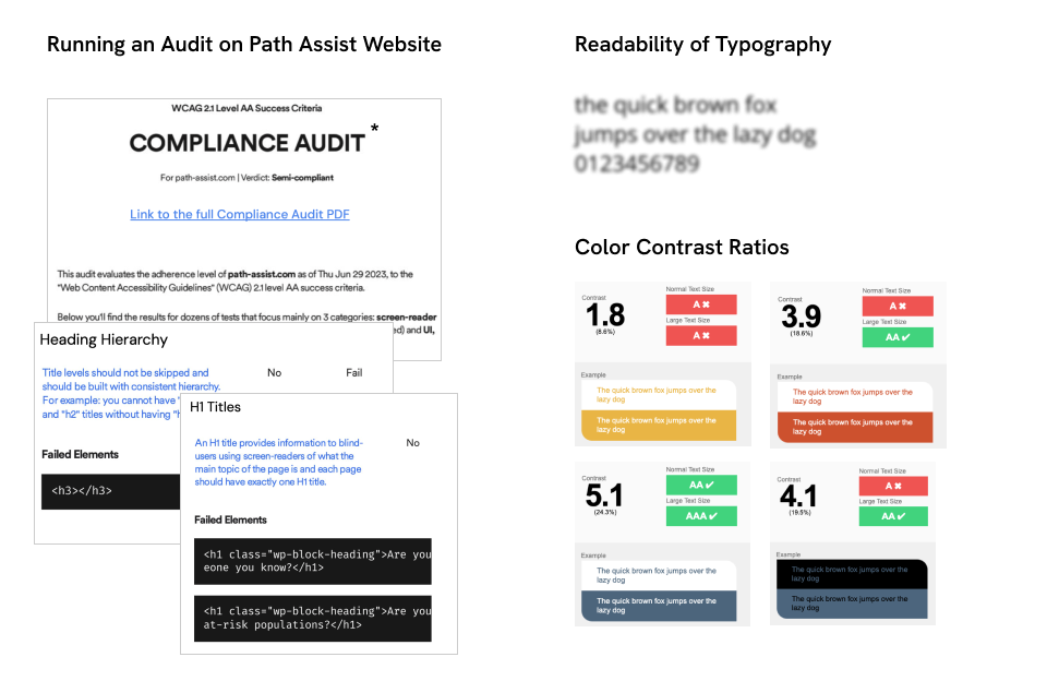
Running an audit of digital design assets for accessibility.
I collaborated closely with our Lead Graphic Designer to develop a new, cohesive color palette that not only aligned with our brands but also enhanced accessibility across all platforms. This effort ensured a more inclusive and visually consistent experience for all users.
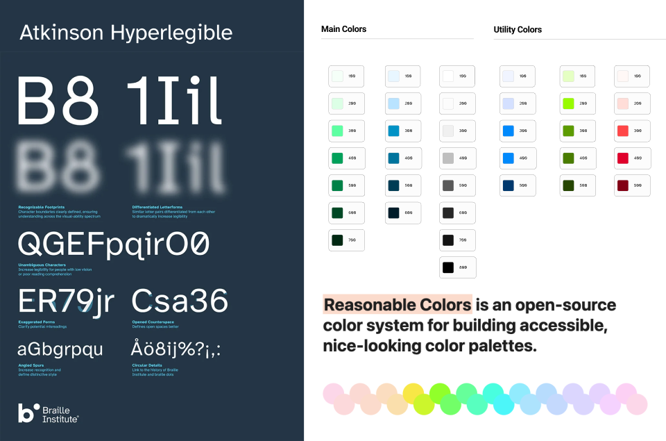
Atkinson Hyperlegible and the new color palette were implemented with a focus on accessibility, ensuring that all visual elements met the highest standards for readability and inclusivity.
In our legacy product, we utilized older versions of Bootstrap that lacked built-in accessibility features. To address this, we prioritized accessibility in selecting our new UI library with additional considerations to factor in. I proposed the four UI libraries listed below for evaluation.

Selecting UI libraries for rapid development with a strong emphasis on accessibility. We selected Material UI.
To advocate for a new design direction focused on accessibility, I effectively communicated its value to C-suite leadership by presenting data and case studies that demonstrated the positive impact of accessible design on user experience, customer satisfaction, and business performance. By emphasizing the benefits of inclusivity in reaching a broader audience and ensuring compliance with industry standards, I successfully garnered support for our initiative.
Our first project under the new design direction involved updating an outdated website that utilized HubSpot's backend CMS. This posed a challenge, as we were not starting from scratch. The marketing team and our Lead Graphic Designer spearheaded the initiative, incorporating our new design elements. As the launch approached, I collaborated with our Lead UX Researcher and the Marketing department to conduct an accessibility audit of the new website.
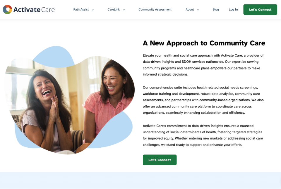
Website with a new design direction centered on accessibility.
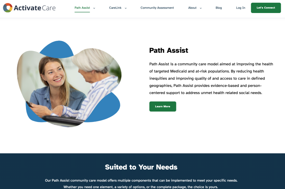
Website with a new design direction centered on accessibility.
With Material UI and Joy UI as the selected component library, Activate Care is now fully equipped to advance new patient-facing design initiatives. While the applications are currently under NDA and cannot be shared, I can present key components in development for our pilot projects. These form components are the backbone of the new design system, ensuring a cohesive, accessible user experience across all platforms.
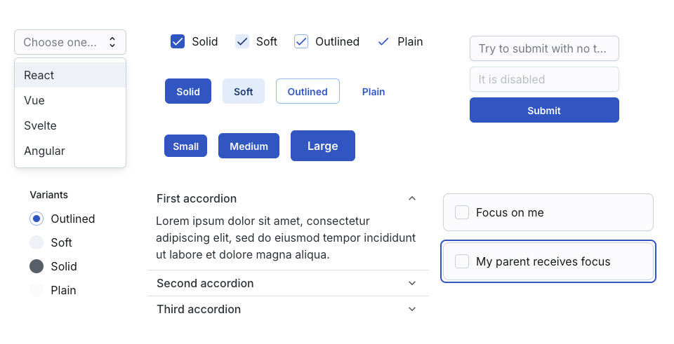
I began with form components, as they are a critical aspect of patient-facing applications.
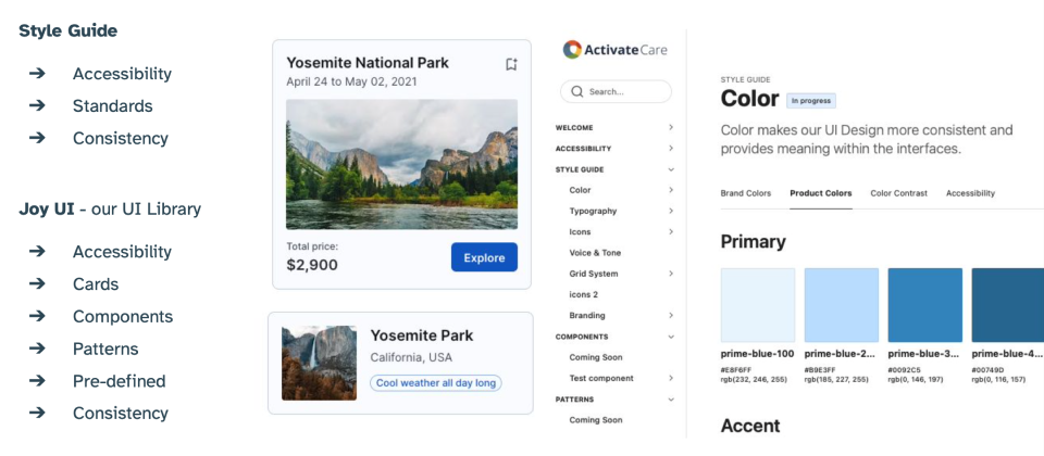
I used ZeroHeight to start the documentation of the Style Guides as well as the Design System.
As I was collaborating closely with our Front-End Engineering Lead to launch the new Design System, Activate Care underwent a corporate restructuring. Although the patient-facing applications are still in development, I am confident that the design foundations we established will enable the organization to scale effectively and ensure a more inclusive experience for all patients.